When you get into the world of color mixes you open an infinite chapter. If secondary colors, in fact, are 3, the possible combinations multiply enormously!
Eugene Chevreul, a famous chemist, consacrated his life to complementary colors, studied their brightness and contrast, and even published a color encyclopedia in 1864, trying to collect all the possible shades: he found 14,400.
Even today his “cromatic wheel” is a point of reference for the study of color.
Going back to the main secondary colors, definitely green remais the most popular, at least in nature!
Green is the color of Mother Earth, a symbol of peace, calm and balance. For the Chinese it embodies the yang principle: masculine, active and vivifying! If you want to take care of your health with green, you have to know it is perfect for hypertension, eye tiredness and nervousness; pure relaxation!
These fantastic peculiarities are better and better known, in fact green is frequently used in schools, offices and hospitals.
The same for the coolest projects of interior design. The greenest of all?
The Arola-Samsung restaurant in Barcelona: all green!
The Arola-Samsung restaurant in Barcelona: all green!
Speaking of design, my green “ must have”: the “midsummer” lamp by Tord Boontje!
Of course in green!
http://www.polyvore.com
Of course in green!
http://www.polyvore.com
Orange is the symbol of pure energy: coming from red and yellow, it has the same properties but not the negative aspects! It's perfect to cure lungs , thyroid and spleen, it brings optimism and happiness!
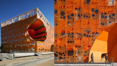
“Orange” projects are spreading all over the world with great success! An example of personalities really fond of “orange” are the architects Jakob and Macfarlane who often use it in their projects: here are two examples, in Lyon and in Paris.
and for the interiors, the Spanish studio Tomas Alia just works with pure colors, very therapeutic!
The real orange “must have” is supposed to be the fl/y lamp by Kartell,
but I have recently fallen in love with the “Bright Wood Collection” by Avanzini that lightens and changes color; high price but super design!
Purple is a cold color but it is related to creativity, to spirituality and to the force of mind.
It relaxes, moderates appetite and helps circulation, a real beauty elixir; for these properties it is frequently used in all beauty treatments in spas and fitness centers!
But it is quite hard to insert purple in interior design because it's a powerful color. For this reason the ideal solution is definitely the one of introducing it with small color elements and diffusely through light; a fluid wellbeing!
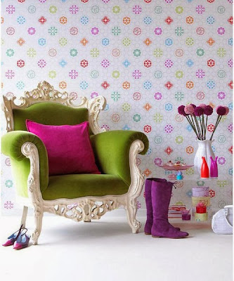
An irremissible purple design element: a wall covered with wallpaper!
You can find beautiful ones on http://www.designyourwall.com
You can find beautiful ones on http://www.designyourwall.com
Aren't these colors enough?
We'll find more and more!
We'll find more and more!
Stay tuned


No comments:
Post a Comment