I'm a “colorful” person: at home, in my clothes, in my purses, wherever I look into my life, I can see color.
But what induces people to choose a color rather than another one? And which are the best colors?
Of course we are driven towards a color by the moment fashion, you see and see it again, and you can't do without. For example my passion for the “turtledove” color has become a legend; turtledove buildings, turtledove brochures, turtledove tiles, turtledove furniture, turtledove logos, etc. But we “feel” many colors because they belong to our memories and experiences.
Anyway, each color has a direct relationship with our body. Colors,reflecting light, have different wavelengths that interact directly with our brain and our organs.
Do you have a fever? Shut yourself up in a blue room, with blue sheets and a blue light, and everything will surely go.
Color has always had a great importance, so much that in the past the “cochineal”, an insect used to prepare the red color, was exchanged with gold and silver and was considered one of the Spanish Empire treasures!
All this teaches us the choice of the colors to use at home has to be taken very seriously .
Tendentially colors should be mixed to get a perfect balance of stimulation of the different senses, but history is full of people really fond of color!
Zaha Adid in the new hotel he designed in Madrid, used just pure colors: white or black bedrooms, red or orange bathrooms!
http://www.zaha-hadid.com
But colors used so “massively” might have collateral effects.
Red is a strong stimulant, it increases blood pressuse, fires and excites passion! It's the color of love and of spicy food.
Red is a strong stimulant, it increases blood pressuse, fires and excites passion! It's the color of love and of spicy food.
A bit of red is necessary at home to be always stimulated and never bored; maybe better in the living room, in the dining room or in the kitchen, definitely not suited for sleeping!
But you can't resist passion! Actually the famous designer Verner Panton, great precursor of the use of intense color, consecrated a whole room of his project for the “Varna Restaurant” in Arhus, Denmark, to red. Floor, lamps, tables, chairs, all strictly of the same color! An “electrifying” result!
My red cult piece? Of course the “Egg chair” by Arne Jacobsen !
http://www.fritzhansen.com
http://www.fritzhansen.com
Among the three primary colors, yellow is the color of the sun and of gold. It helps reflex readiness, muscle tone and stimulates perception. If you feel blue, yellow is the color for you!
The architects Lange and Ingels know a lot about “yellow” designing; they have built a sunny building to fight cold and the grey Danish sky.
If we wanted to glance at design dedicated to gold, we could really sweep through it!
Love for what is glittering is boundless; both in the East and in the West there are a lot of projects dedicated to golden architecture. A little example to whet curiosity: the American architect Robert Stone realized a house in the middle of the Californian desert, completely designed in gold and champagne nuances , a real sparkling “mirage”!
Small as it is, cult yellow in the kitchen! “Smeg” fridge is now a design icon!
Ahhh blue, how wonderful the shades of blue are: aquamarine, light blue, Persian blue, sky-blue, electric blue, night blue, ultramarine …
I like all of them, none excepted, and in the blue I could live forever: it's the color of water and of sky, of serenity, of reflection. If you have any nervous tension or any inflammation, blue is a real panacea!
My favorite “blue” project is very technologic: the Hotel Hilton Maldives Resort & Spa Raganali Island has a restaurant and some rooms with a view of the seabed thanks to wonderful glass caps! A really amazing and very “blue” effect!
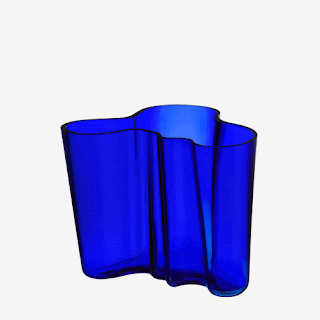
Design in blue for the vase ”Iittala” by Alvar Aalto: pure harmony!
A special mention for white. The sum of all colors, symbol of purity, light, cleanliness, of good that prevails over evil! It's a vitalizing element that fights both mental and physical aging! To be used for dressing, sleeping, eating, working: absolutely no limits!
Philippe Starck, a French designer of genius , loves “white” projects “. The”Hotel la co(O) rniche” he built in France is a blaze of white!
Philippe Starck, a French designer of genius , loves “white” projects “. The”Hotel la co(O) rniche” he built in France is a blaze of white!
The white cult design?
No doubt: “Barcelona chair” by Mies Van der Rohe!
No doubt: “Barcelona chair” by Mies Van der Rohe!
What about all the secondary colors? I leave you to your curiosity now, see you at my next post!
Stay tuned
Stay tuned


No comments:
Post a Comment